Last summer, TrustSwap announced the acquisition of The Crypto App, one of the Top 5 most downloaded crypto portfolio management apps globally. A similar type of acquisition in the market occurred in 2020 when FTX purchased Blockfolio (currently 6M downloads) for $150 Million USD.
Our goals for The Crypto App are ambitious. We have been working on major product and interface updates, from an easy fiat on-ramp to more blockchain wallet tracking, and a ton of other premium features, all focused on $SWAP as The Crypto App’s utility token.
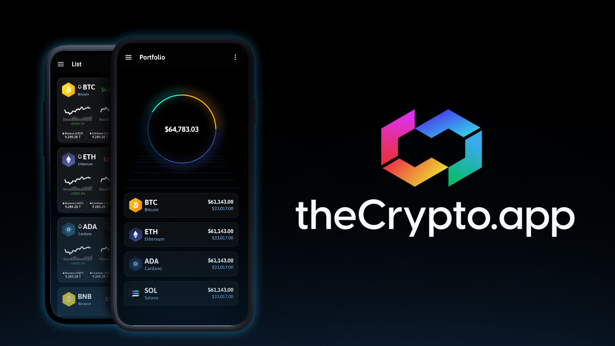
The Crypto App is also undergoing a major brand overhaul and the new logo is already out. We sat down with Martin Kiel, TrustSwap’s Creative Director, to discuss the story behind the new logo.
Interview With TrustSwap’s Creative Director
What’s the story behind The Crypto App’s new logo?
Who are we, as a company, as a community? As individuals, our experiences shape our present and influence our future. The brands we adore express our ambition for differentiation and identity, the uniqueness which defines us.
For the longest time, The Crypto App’s logo showcased and identified with the most prominent entity in the industry, Bitcoin. We feel this was relevant and it has served us well.
However, as The Crypto App matures in this emerging market, we understand the time is right for the brand to evolve into a new form which signifies a shift to our own unique personality as a brand, as a company, and as a community.
We believe the essence of a logo isn’t solely in its final form, but in the series of considerations made during its conception.
Where did you find inspiration for the new logo?
Short answer: everywhere. When it comes to our products and services we make a habit of considering a variety of options in order to make informed decisions and this time was no different.
We sourced dozens of artists from all over the world, creating hundreds of concept art iterations over a period of many weeks. We tested various key themes from the abstract to ultra-minimalism, to market intelligence, to meme territory identities, and more.
After an initial selection phase within the creative team, we conducted an additional round of filtering, and this left us with 3 final selections. In the end, highlighting our intent to enable community-led product decisions, we let our users choose the final design.
Through a community voting drive, we decided on the final logo which will represent The Crypto App across the web going into this next chapter of our story. We feel worldwide, collective, inclusive efforts enrich the identities we create.
What message do you hope the new logo and branding will convey?
Simplicity. This is the mark of evolution in the brand, and it’s a statement. In everything we do, we will pull inspiration from simple designs which surround us. Yet, it’s also more than that. The way we do things isn’t just skin deep, it goes deep below the surface into our roots and our foundations as a company.
While we present a logo today, and we reconstruct our visual identities for tomorrow, know that the beauty of a statement, of a product, or of a logo is invigorated by the people and the intent behind it.
The Connection Between Logos And Brand Awareness
All of the most well-defined brands have a logo that resonates with customers and is memorable in some way. We sourced dozens of artists from all over the world to help us develop concepts for The Crypto App’s new logo because we understand the importance of a logo to the overall public awareness of a brand. With this new logo The Crypto App has the potential to gain a more recognizable presence on Google Play and the App Store, leading to more downloads.
What do you think of The Crypto App’s new logo? Let us know at [email protected]!